Post-Production
Editor’s Note:
Being the editor of Attabad to Ajrak, my primary intent was to ensure the flow of the narrative is natural and realistic as reflected as love story style of the film. I did not rush to use fast cuts or artificial transitions but girls chose to relax and make each shot breathe. This gave the audience time to take in the setting as well as the emotional colouring without a sense of being hurried. The film was shot on sony camera a7 iv with two lenses viltrox 1.2 35mm and 85 sigma 1.2 lens.
All the film editing was done on Adobe Premiere Pro;
To create the setting and have a relaxed introduction, the first sequence was cut with more shot lengths. I also applied extensive shots and slow movement to capture the quietness of Attabad and bring the audience to the actual place. These shots were specifically located in front of no emotional or cultural scenes so that the audience would be able to relate to the space in the first place.
In the travel sequences I made the editing more lively, although not very fiery. The shots carried by hands were arranged in a sequence, so that the effect of movement and development would be preserved. I did not use jump cuts, but I used natural continuity as it favors the observational mode of film.
The cultural part about the Ajrak was framed closer and contained slower transitions. To highlight the symbolic meaning of the piece of fabric, I inserted medium shots between the characters with the fabric. This editing decision would motivate the audience to think of the Ajrak as identity and heritage instead of an object in the background.
In the emotional passages, I gave preference to reaction shots and close-ups. They remained longer on the screen in order to enable facial expression and body language to convey meaning as well as the existence of location. I did not over-use music or sound effects in such moments in order to make emotion real and not artificial.
The last sequence was cut to reflect the beginning with wide shots and less points of cutting. This makes the film have a circular form and provide a form of closure. In general, my editing approach was centered on simplicity, realism, and emotional honesty, which is appropriate to the documentary genre and helps to underline the meditative mood of the movie.
Colour Grading:
All through the film, I used minimum colour grading on Adobe Priemere Pro in order to maintain the natural and realistic appearance of the footage. I did not rely on heavy filters or stylized effects, as my attention was on the basic colour correction, like adjusting an exposure, contrast, and white balance to ensure that all the scenes would look visually similar.
In the initial landscape scenes, I have made slight adjustments to the blue and green colour of the lake and mountains with the saturation being low. This made sure that the surroundings were clean and appealing to the eyes without being artificial. The intensity of lighting was adjusted in order to prevent excessive exposure to the natural sunlight.
In the travel and transition scenes, I have used very subdued and natural tones. Shadow was lifted a bit so as to keep detail in darker people, but no dramatic colour transitions have been used. This assisted in keeping the observational documentary appearance and prevented a cinematic or fictional appearance.
In the cultural scenes with the Ajrak, I left the red and indigo colours of the cloth to be brought out in their natural form. I have not overloaded these colours rather I have diffused the intensity of the surrounding colours such that the Ajrak organically stands out in the frame. This grading is subtle but it holds the symbolic significance of the Ajrak.
I used less contrast and warmer white balance in the emotional and interior scenes. This made the atmosphere closer and made the skin tones appear natural and uniform. The concluding scenes were graded to resemble the beginning in tone, with equal brightness and low saturation so that the final scenes would be calm and reflective.
On the whole, I used a subtle colour grading style as it was in agreement with the film mode, and it facilitated visual intelligibility without interfering with the emotional and cultural subject matter of the film.
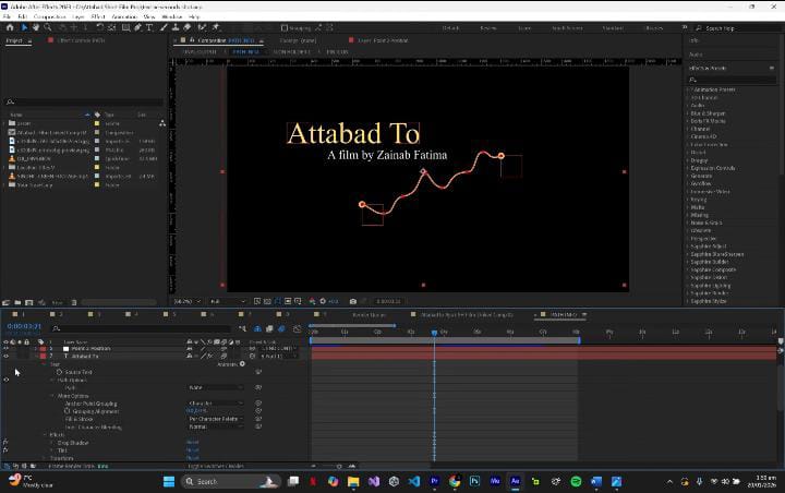
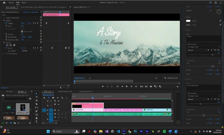
Here are some screenshots while editing the film;

I added Adobe Premier Pro visual fonts for all the subtitles and opening of the film word fonts
I also created a visually pleasant opening of the film Attabad to Ajrak on top of the Attabad lake overview shot.